c
2025-
2026
project
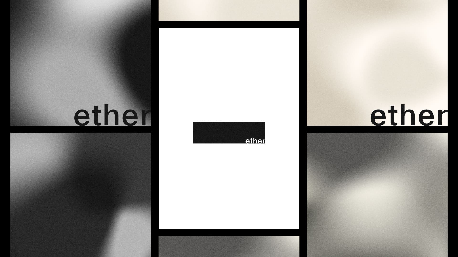
Ether
bio
Story-Driven
Educational Platform
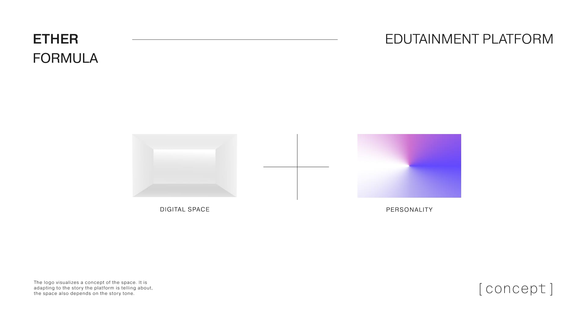
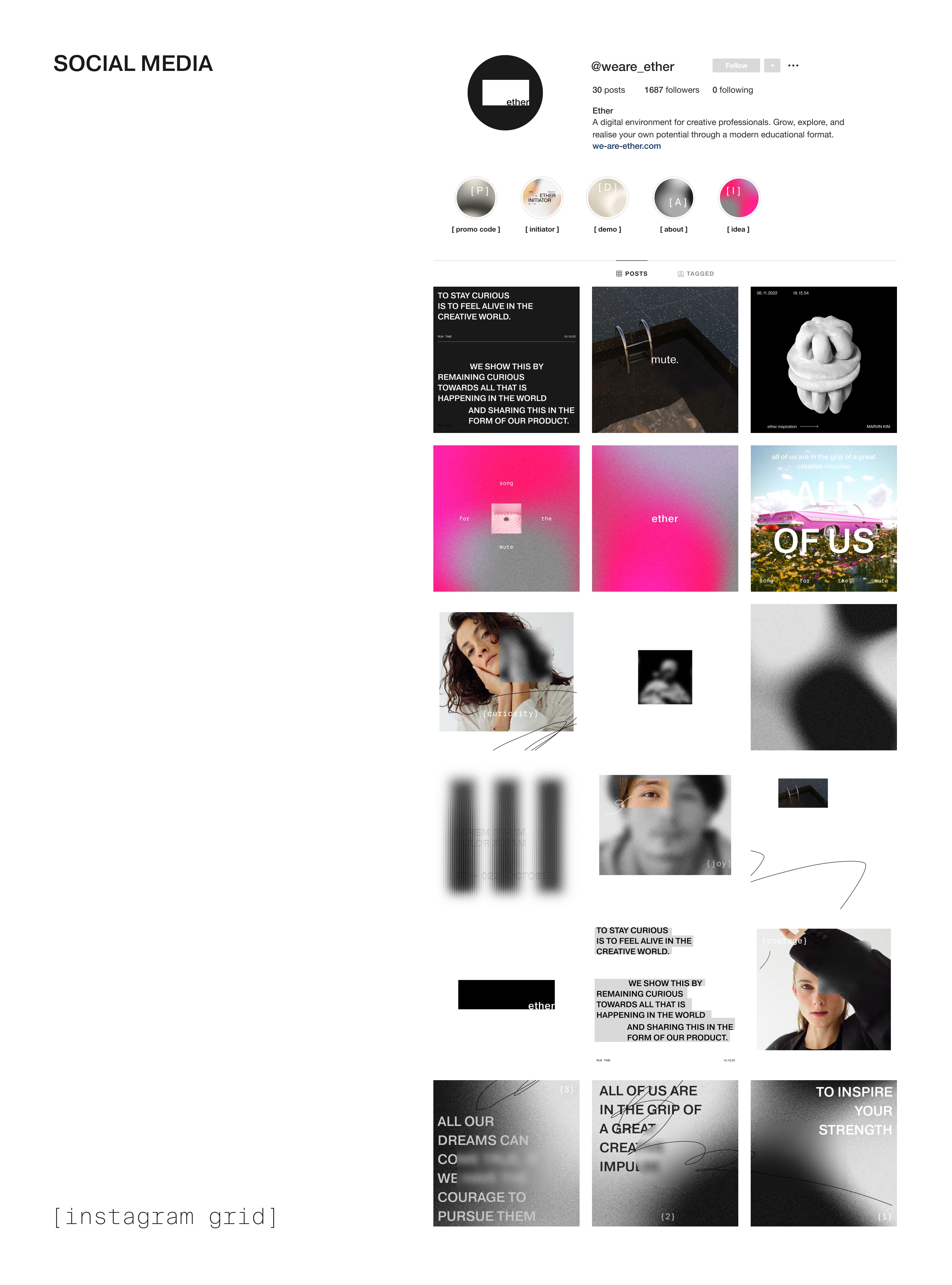
Ether is an edutainment platform designed for creative professionals. It offers an intuitive and enjoyable learning experience, bringing together essential skills, curated content, and community insights – all within a unique digital space tailored to the creative industry.
deliverables
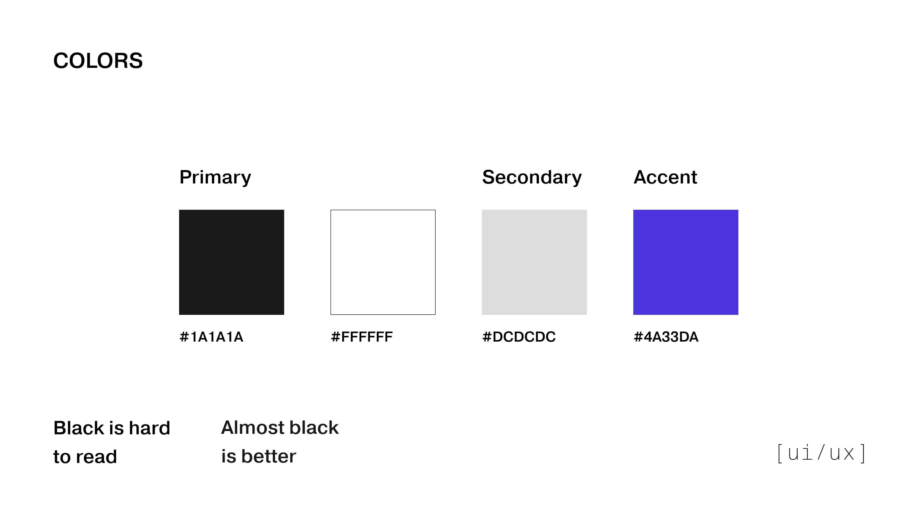
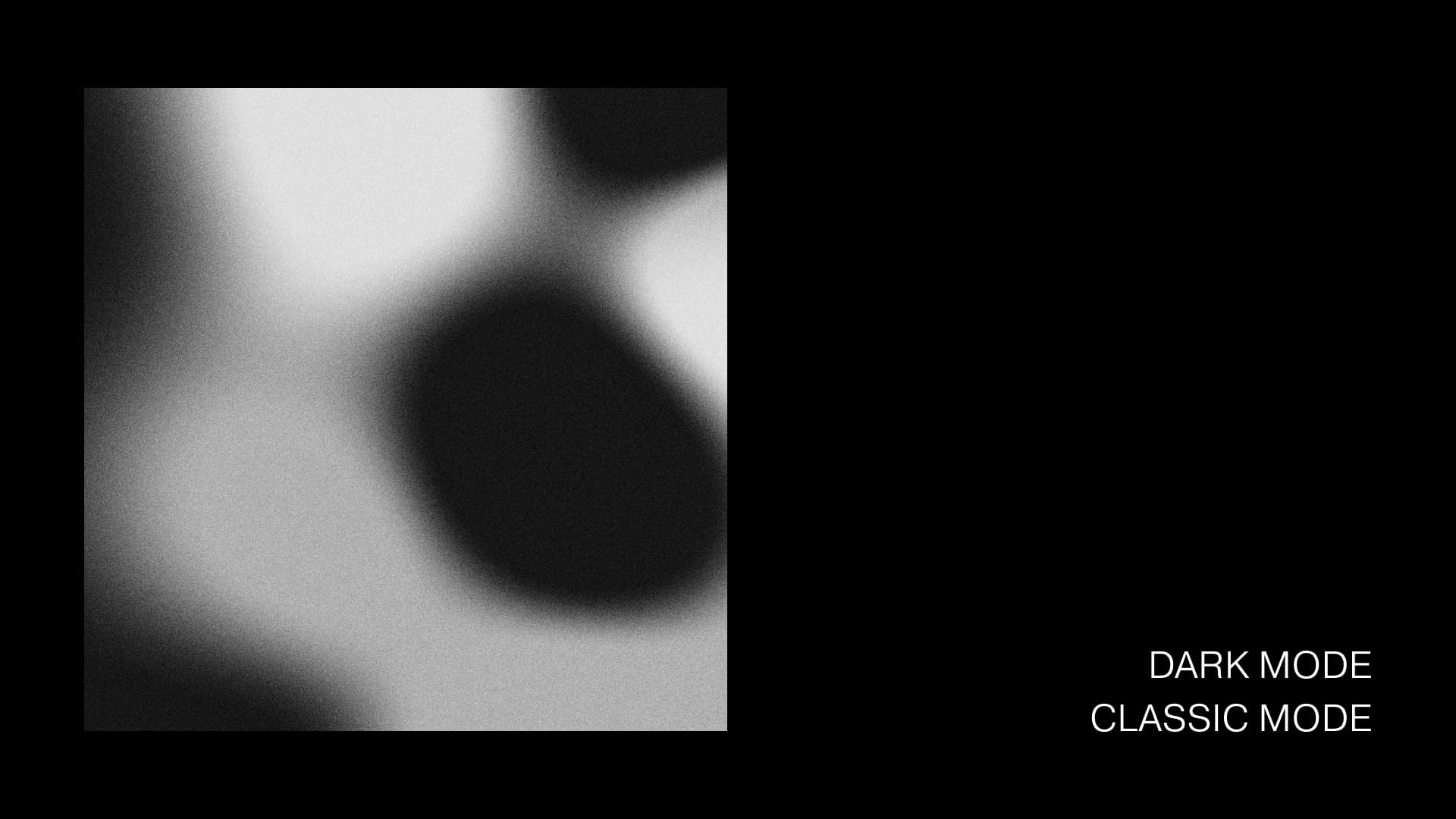
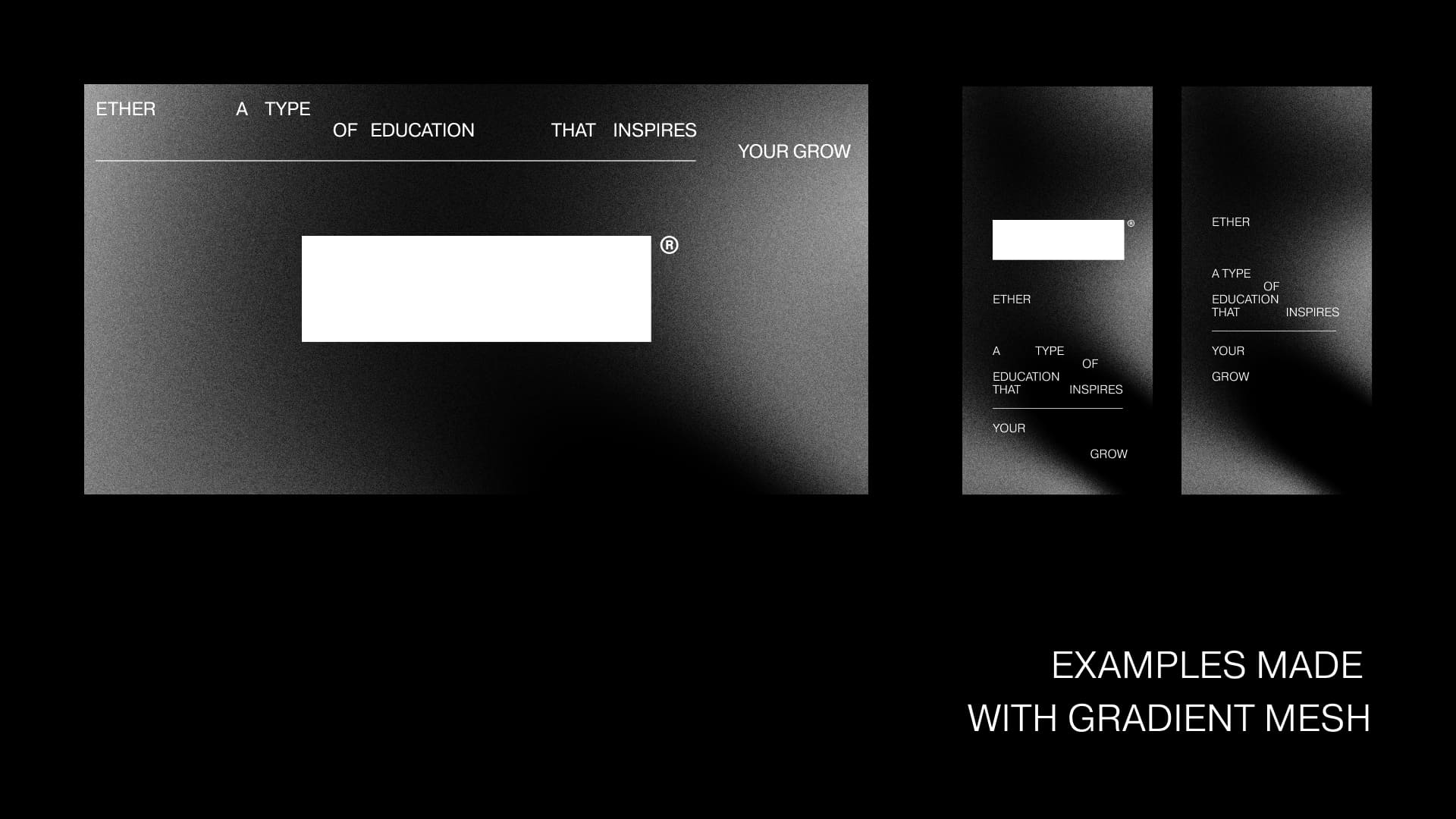
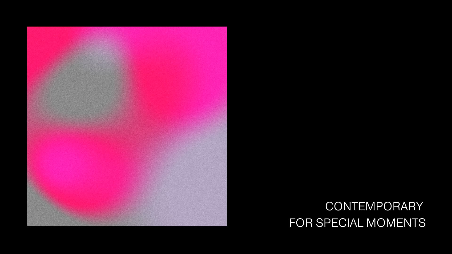
Branding
UI/UX
SMM
Motion Graphics
year
2022

Related projects

project
Ether
bio
Story-Driven
Educational Platform
Ether is an edutainment platform designed for creative professionals. It offers an intuitive and enjoyable learning experience, bringing together essential skills, curated content, and community insights – all within a unique digital space tailored to the creative industry.
deliverables
Branding
UI/UX
SMM
Motion Graphics
year
2022